Spring family
True Spring
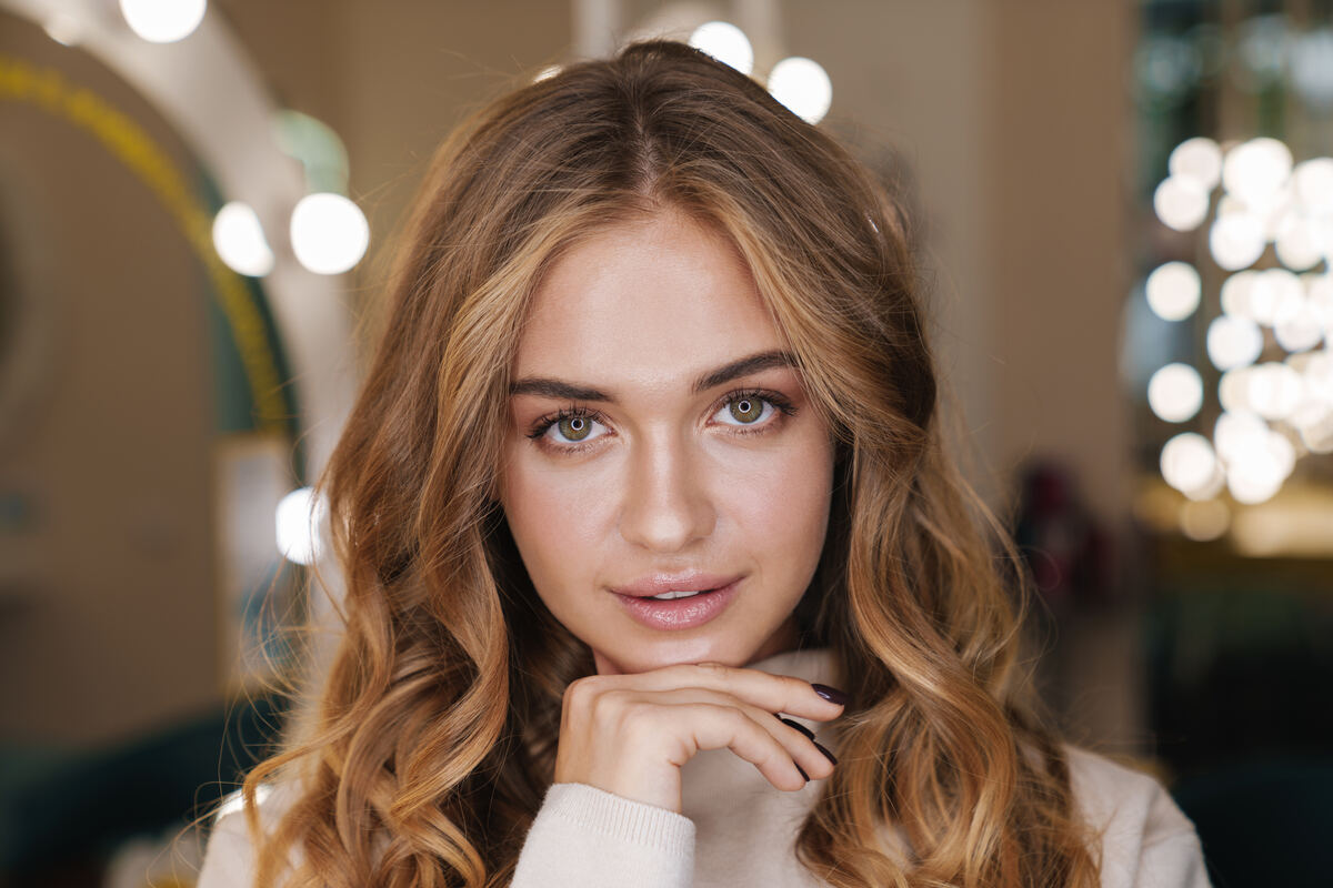
The warmest of the springs, at middle lightness. Coral, orange and leaf green sit on warm browns, and the whole look runs clear and bright.
Warm and clear at mid-light: the warmest spring, with coral, orange and leaf green.
True Spring
Who it is
True Spring is the warm season at middle lightness. Warmth leads your reading at 1.5, with lightness and clarity each at 0.5. The usual face has golden to warm medium brown hair, light-medium skin, and eyes that are warm brown, hazel or a clear blue-green. Contrast is medium: there is a visible step between your hair and skin, but not a sharp one. A season is a range on measured scales, not a type of person, and skin color alone never decides it. Your reading weighed skin, iris and facial contrast together.
Your colors
Twelve of your 72 colors
Of the spring palettes, yours is the most openly warm. Your core leads with Orange, Saffron, Clear Green, Mid Turquoise, Bright Blue and Clear Pink, and every one of them is clear, never dusty. Turquoise gets room here, but aqua stops short of neon. Your four signature accents are Coral, Amber, Clear Moss and Turquoise. Use one at a time, near the face if you like it there, and let the neutrals carry the rest of the outfit.
True Spring
Neutrals and white
Your white is Pale Cream, a warm clear white of the ivory kind. Your deepest neutral is Sable, a dark brown with warmth in it, and it takes the place of black and navy. Blue-grey neutrals are on your skip list. Build the base from Tobacco, Hazelnut, Latte, Champagne and Oat, a run of warm browns and creams. Peat and Truffle are there when you want a darker, quieter brown. A Latte coat over Pale Cream with Sable boots is a complete, warm neutral outfit.
True Spring
Contrast and black
Medium contrast means the value step between pieces near your face can be medium too, from 25 to 45 L*. That is the room between Pale Cream and Orange, or Champagne and Tobacco. You can go lower for a quiet day, but a very high step, like cream against near-black, asks more of your face than it gives. Black near the face is for the Winters only. Your Sable does the same job and keeps the warmth in your skin.
Metals and finish
Gold, polished
Your metal is gold, because your warm lean is the strongest in the spring family, at 1.5. Your finish is polished, because your clarity sits at 0.5, on the polished side of the line. Silver and brushed finishes belong to the cool and soft seasons. No season is assigned rose gold. Pick yellow gold with a bright shine, and pair it with the Saffron and Amber you already wear.
Makeup
Shades that keep the face soft
Match foundation to the skin itself in daylight. Yours sits about Monk 5, with a warm family listed at this depth. Monk gives depth only, so read each brand's own undertone words and keep them as written. Everyday lip reference is Deep Terracotta. A statement lip goes deeper, to a deep red. Blush reference is Red Clay. Bronzer reference is Hazelnut, and Hazelnut is also one of your palette colors. For blue eyes, shadows in Tobacco, Latte or Champagne make them stand out. For green eyes, use Rich Purple, Orchid or Bright Purple. Hazel eyes stand out with Bright Blue, Rich Light Blue or Cerulean. Makeup will not make an outside color work beside your face.
True Spring
Hair
Typical hair runs from golden to warm medium brown. Aim for your natural level, plus or minus 2, with no extra lift or depth, since True Spring sits in the middle on lightness. The tone is golden, not ash. If your hair is level 4 or deeper, brows one level lighter look softer. If it is level 7 or lighter, brows one level deeper define the face. A level or tone number belongs to one brand's chart, so choose by that brand's shade name.
True Spring
What to skip
Skip black near the face, blue-grey neutrals, neon aqua and dusty, greyed-down mid-tones. The greyed ones are the easy mistake, because they look sophisticated on a hanger and read tired against clear warm skin. A color outside your palette can still work low on the body, at the hem, the bag or the shoe.
True Spring
Your sisters
Light Spring shares your warm lean, clear color, gold and polished finish. It is lighter, with low contrast, and its deepest neutral is Walnut, softer than your Sable. Bright Spring sits on your other side. It shares your warmth, your gold and your polished finish, but clarity leads there, contrast is high, and its palette carries the strongest accents in the family. Adjacent palettes allow selective borrowing, but your own 72 colors come first.
Prints
Prints with a medium value step
A print is a set of colors and a value step at once. Check its lightest and darkest parts against your palette, and each color in between.
From The Edit
Pieces for True Spring
Each piece is named for the color in your palette it sits closest to.
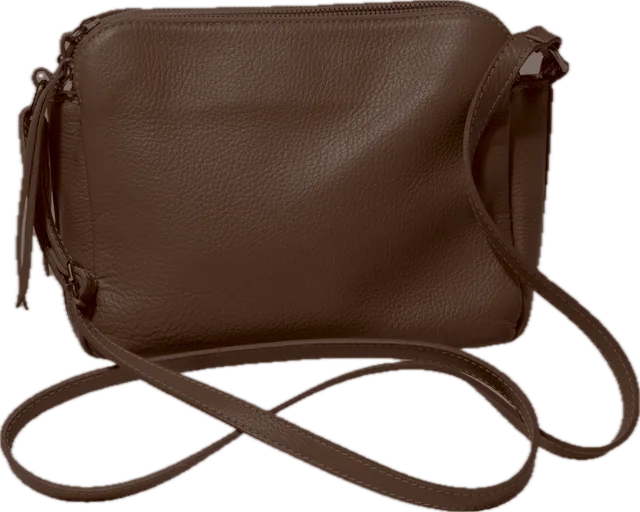 BagSable
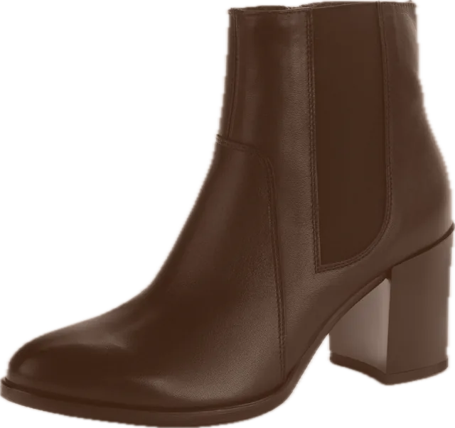 BootsSable
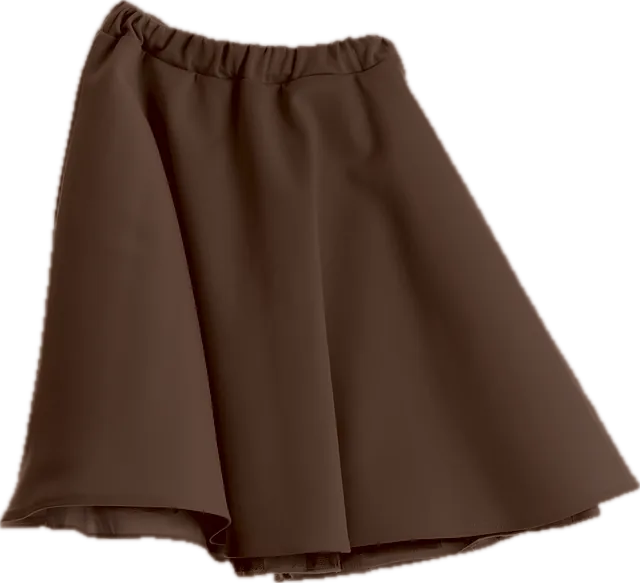 SkirtSable
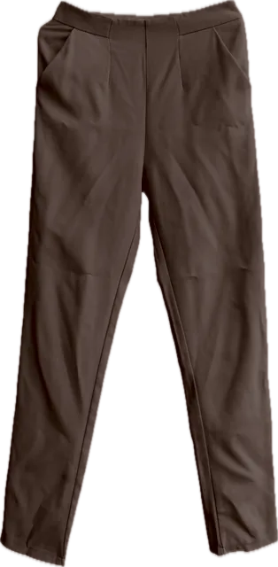 Slim pantPeat